How To Create an Animated Image Gallery Using HTML and CSS
Blogger Leb
October 18, 2020
0
create an animated Image Gallery using only common HTML and CSS programming languages. This image gallery is fully responsive and animated using only simple HTML and CSS programming languages.
I am Shantanu a web developer. I'm going to teach you and let you know how to create an animated responsive image gallery. Here I have shown you step by step so that you can understand how it is made. The programming code used here is written very simply so that those who do not have programming knowledge can understand. Hopefully, this image gallery will help you a lot to increase your knowledge and knowledge about programming.
Create an Animated Image Gallery Using HTML and CSS 2020
Some special information about image galleries
This Responsive Image Gallery is built using common HTML and CSS programming languages. This image gallery is fully adjustable for different devices to be fully professional and animated and responsive.
In the case of desktops or laptops, it can be seen in three images along the horizontal, and in the case of tabs or tablets, it can be seen in two images.
In the case of mobile, it can be seen in an image along the horizontal, which means that in the case of different devices, it can adapt itself completely.
Watch the video on how to make a SideBar menu using HTML CSS
It has animations, so when you click on this image or move the mouse, the image will zoom up to 2x. Below are the necessary programming codes for your convenience. You can use your project or website by copying those codes. Or you can download the required source code by clicking on the download button below. To watch live, you can watch the live demo by clicking on the demo button below.
Animated Image Gallery Using HTML and CSS[Source Code⇩]
Hopefully from the video above you can fully understand how to make and work this Animated Image Gallery. If you want to try this code yourself, you can. That is why I have given the source code below. First of all, you create an HTML file (rename.html) and a CSS file (rename.css). Then you put the HTML code in the HTML file and the CSS code in the CSS file. Be sure to link the HTML and cis code to each other (<linkrel="stylesheet"href="sidebar.css">).
I would especially request you to download those codes by clicking on the download button without copying the code. Because I had some problems with Google when I uploaded these codes. So I have added some comments to this code. If you want to copy these codes and use them in your project, you can delete those comments. If you do not omit, there will be no problem.
HTML TAGS (<body> Add Code</body>)
This code is an HTML code (rename.html). Put this code in the head tags of your project and also in the head tags in the HTML file.
<divclass="container">
<h1class="heading">Image Gallery with CSS Grid <span>& Flexbox Fallback</span></h1>
<divclass="gallery">
<divclass="gallery-item">
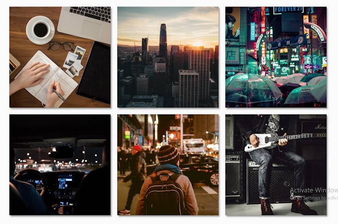
<imgclass="gallery-image"src="https://images.unsplash.com/photo-1488190211105-8b0e65b80b4e?w=500&h=500&fit=crop"alt="person writing in a notebook beside by an iPad, laptop, printed photos, spectacles, and a cup of coffee on a saucer">
<p>Like on Facebook <i class="fa fa-facebook "></i> </p>
</a>-->
<divclass="gallery-item">
<imgclass="gallery-image"src="https://images.unsplash.com/photo-1515260268569-9271009adfdb?w=500&h=500&fit=crop"alt="sunset behind San Francisco city skyline">
</div>
<divclass="gallery-item">
<imgclass="gallery-image"src="https://images.unsplash.com/photo-1506045412240-22980140a405?w=500&h=500&fit=crop"alt="people holding umbrellas on a busy street at night lit by street lights and illuminated signs in Tokyo, Japan">
</div>
<divclass="gallery-item">
<imgclass="gallery-image"src="https://images.unsplash.com/photo-1514041181368-bca62cceffcd?w=500&h=500&fit=crop"alt="car interior from central back seat position showing driver and blurred view through windscreen of a busy road at night">
<p>Like on Facebook <i class="fa fa-facebook "></i> </p>
</a>-->
<divclass="gallery-item">
<imgclass="gallery-image"src="https://images.unsplash.com/photo-1445810694374-0a94739e4a03?w=500&h=500&fit=crop"alt="back view of woman wearing a backpack and beanie waiting to cross the road on a busy street at night in New York City, USA">
<p>Like on Facebook <i class="fa fa-facebook "></i> </p>
</a>-->
<divclass="gallery-item">
<imgclass="gallery-image"src="https://images.unsplash.com/photo-1486334803289-1623f249dd1e?w=500&h=500&fit=crop"alt="man wearing a black jacket, white shirt, blue jeans, and brown boots, playing a white electric guitar while sitting on an amp">
</div>
</div>
</div>
CSS CODE (<head><style>Add code</style></head>)
This code is a CSS code (rename.css). You enter this code in the style tags in the head tags of your project. Also, you put in the style tags in the CSS file.
/*
All grid code is placed in a 'supports' rule (feature query) at the bottom of the CSS (Line 77).
The 'supports' rule will only run if your browser supports the CSS grid.
Flexbox is used as a fallback so that browsers that don't support the grid will still receive an identical layout.
We hope you enjoy this Animated Responsive Image Gallery. And you have learned and learned how to create a Responsive, Animated Image Gallery using only HTML and CSS programming languages. If you have any problems, please let me know in the comments. I will try to solve all your problems related to this image gallery.